Logos
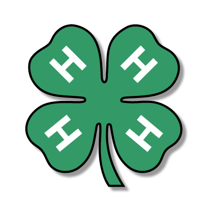
The 4-H Emblem is a vital part of the program’s identity and represents more than a century of youth development through learning, leadership, and service. Since the early 1900s, the four-leaf clover marked with an “H” on each leaf has stood for Head, Heart, Hands, and Health. To ensure a consistent and professional image across all materials, proper and unified use of the 4-H Emblem is essential.
Disclaimer: Use of the 4-H Name and Emblem is restricted to official, authorized 4-H programs and communications only. Always ensure proper authorization before use. See Procedures, Guidelines, Authorizations, Consents & Waivers for the 4-H Name and Emblem Usage Application Form. Contact Dr. Shannon McCollum for guidance.
4-H Emblem
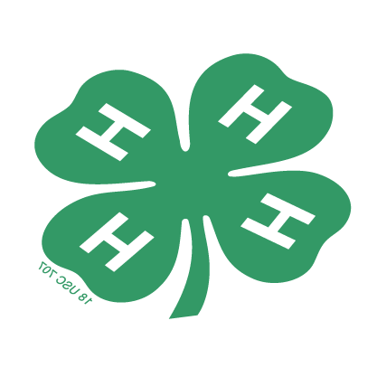
The primary 4-H Emblem should be used whenever possible in branded materials.

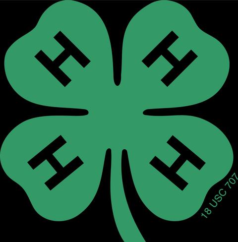
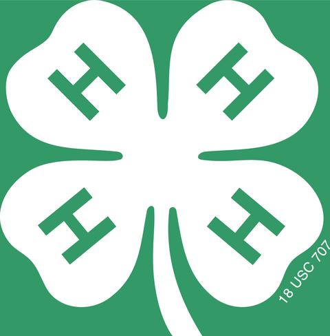
Like the 4-H Name, the 4-H Emblem is federally protected, which means the emblem must always include the legal insignia “18 U.S.C. 707”, and appear exactly as provided in the official logo files.
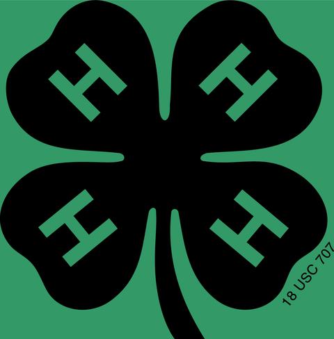
The green clover is preferred whenever possible, but the emblem may also appear in approved white or black variations.
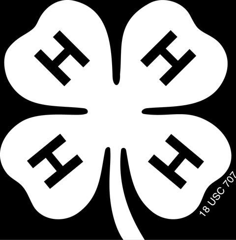
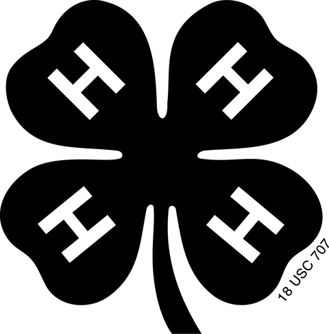
The “H” characters in the clover must only be green, white, or black. These are the only approved colors for the Hs under any circumstance. Maintaining these specific color combinations preserves the integrity and recognizability of the 4-H Emblem.
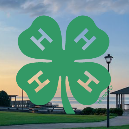
When selecting emblem variations, always choose a version that provides strong contrast against the background to ensure clear visibility. The color of the Hs must also clearly contrast with both the clover itself and the background. Whenever possible, the best practice is to use the version where the Hs match the background / surface being printed on. For example: Always ensure the emblem remains clear, legible, and properly contrasted without outlines, gradients, or color alterations.
Emblem Contrast Quick Reference
- On a green clover, the Hs should be white for proper visibility. Black Hs may be used, but only if needed.
- On a white clover, the Hs may be black or green, depending on which creates the best contrast with the background.
- On a black clover, the Hs may be white or green, though white is preferred for stronger visibility and consistency.
- On a green background, use the white or black clover with green Hs.
- On a black background, use the green or white clover with black Hs.
- On a white background, use the green or black clover with white Hs.
- On white paper when printing in black and white or grayscale, always use the black clover with white Hs to maintain clarity and contrast.
Secondary Type Treatment
The secondary 4-H 'logo' is a type treatment, meaning it is an approved text-based visual of the “4-H” Name. It provides a clear way to display the name alongside the emblem and supports greater brand recognition.
The secondary type treatment is never used in place of the primary 4-H Emblem. Instead, it is a supporting graphic element.

The type treatment may appear in green, and may also be used in white when placed on green or other dark backgrounds.
To maintain visual consistency, avoid mixing different color versions of the type treatment within the same set of materials.
Incorrect Logo Usage
The 4-H Name and 4-H Emblem are federally protected under 18 U.S.C. 707, meaning they cannot be altered or recreated in any way. Changing colors, proportions, or adding effects like borders or shadows violates these guidelines and weakens the integrity of the 4-H brand. Consistent use of the official emblem ensures 4-H is represented clearly, professionally, and legally across all materials.
Below are common examples of incorrect emblem usage to avoid:
Common Mistake #1
The emblem can never be flipped, rotated, or stretched in any direction. The stem must always point to the right, and proportions must remain consistent.
Common Mistake #2
The emblem can never be obscured by words, graphics, or symbols. Accompanying text or visuals should appear above, beside, or below the clover, never over top of it.
Common Mistake #3
The Hs within the emblem can never be transparent. They should remain solid in the approved colors to ensure full visibility and contrast against any background.
Common Mistake #4
Additional elements can never be added directly to the emblem, such as outlines, shadows, gradients, shapes, or other design alterations. The emblem must always appear exactly as provided in the official logo files.
Most importantly
The emblem must always include the legal insignia “18 U.S.C. 707”, which must remain visible, unaltered, and in its correct position.
Logo Downloads
Using the correct file formats keeps the 4-H Emblem clear, consistent, and compliant across all materials. Logo files are provided in multiple formats to support both digital and print use.
Each file type serves a different purpose:
- EPS is intended for high quality print and large scale production.
- SVG is ideal for scalable digital and print applications without loss of quality.
- PNG is best for digital use and transparency needs.
- JPEG works well for simple digital applications without transparency.
While EPS is the preferred format for print, SVG is included as a flexible alternative for platforms and software that do not support EPS files. For Canva users, SVG files are the ideal option since they remain fully editable, scale cleanly, and maintain crisp edges regardless of size or application.
Digital Files
For digital projects, use PNG or JPEG files for websites, social media, email, and presentations. These files are formatted in RGB, which ensures accurate color on screens. PNG is preferred when transparency is needed, while JPEG works well on solid backgrounds. SVG files are also included for situations where scalable artwork is helpful in digital layouts, though PNG and JPEG will meet most digital needs.
Print Files
For printed materials, use the EPS files whenever possible, as they are vector-based and ensure sharp, accurate reproduction in CMYK. PNG and JPEG files are also included for convenience but should only be used for low-impact or internal print needs where vector quality is not required.
Visit the 4-H Downloads and Templates page for all logo downloads.
Color
Color is one of the most recognizable elements of the 4-H brand. Consistent use of approved colors reinforces the 4-H identity and ensures all materials look unified across programs, events, and communications.
Primary Color Palette
The primary colors of the 4-H brand are 4-H Green, White, and Black. These colors form the foundation of the brand and should appear consistently across all materials.
HEX #336699
RGB 51 153 102
CMYK 100 0 90 0
PMS 347

HEX #FFFFFF
RGB 255 255 255
CMYK 0 0 0 0

HEX #000000
RGB 0 0 0
CMYK 0 0 0 100
Pantone Pro Black

To maintain consistency, always use the exact brand color values shown in the guide above. Ensure that you are not using close matches or unapproved shades of green, as even small variations can weaken brand recognition.
Secondary Colors
Secondary colors may be used to complement the primary palette and bring visual variety to designs. They should never replace or overpower 4-H Green as the dominant brand color.
HEX #FDC82F
RGB 253 200 47
CMYK 0 21 88 0
PMS 123

HEX #004438
RGB 0 68 56
CMYK 100 20 59 74
PMS 3308

HEX #82C4B7
RGB 130 196 183
CMYK 56 0 35 0
PMS 570

HEX #C9E3DC
RGB 201 227 220
CMYK 17 0 8 0
PMS 566

HEX #F54359
RGB 245 67 89
CMYK 0 79 50 0
PMS 1785

HEX #EBBDA9
RGB 235 189 169
CMYK 0 28 24 0
PMS 488

HEX #E0DED8
RGB 224 222 216
CMYK 2 3 4 5
Pantone Warm Gray 1

These supporting colors can be used in backgrounds, accents, or design elements to enhance materials while maintaining a clean and professional appearance.
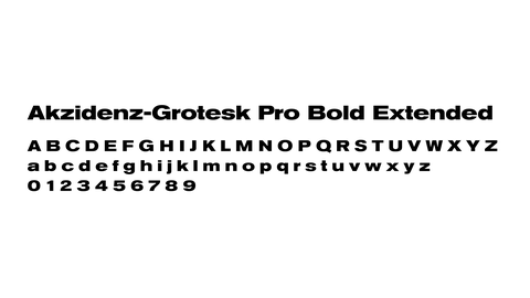
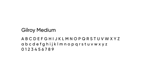
Typography
The primary 4-H typefaces are Akzidenz Grotesk Bold Extended and Gilroy Medium. These fonts are preferred for printed materials, branded graphics, and digital communications where available.
Recommended for headlines, titles, and prominent display text. Its strong, wide letterforms create a confident and recognizable look that anchors top-level messaging
Preferred choice for body copy, subheadings, captions, and general reading text. It offers a clean, modern feel while ensuring clarity and accessibility across both print and digital formats. Bold can be used for headlines and emphasis.
Ensure that you are authorized to use these typefaces before doing so. Access to these fonts may vary by user or location.
Alternative Font
When these specialty fonts are not available, Arial may be used across all media. Arial provides a simple, consistent alternative that maintains readability and supports a cohesive appearance throughout branded content.
*Arial is universally available, requires no special licensing, and is safe for all users to implement.
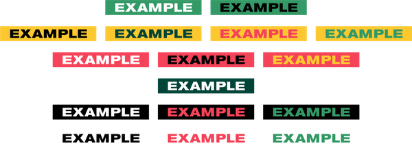
Application
Using official 4-H colors and type together helps create visuals that feel bold, clear, and consistent with the 4-H brand. Using these to create elements like sticker treatments can allow you to highlight key words, calls to action, or section headers while reinforcing visual hierarchy.


Text blocks are typically shown in a slightly slanted orientation which gives them a youthful and energetic feel, though they may also appear straight when needed.
The shape and text colors can be mixed and matched in a variety of different combinations, as long as they maintain clear visibility and strong contrast.
For additional 4-H brand assets and resources, visit the 4-H Downloads and Templates page.